The Gender Gap in Life Expectancy
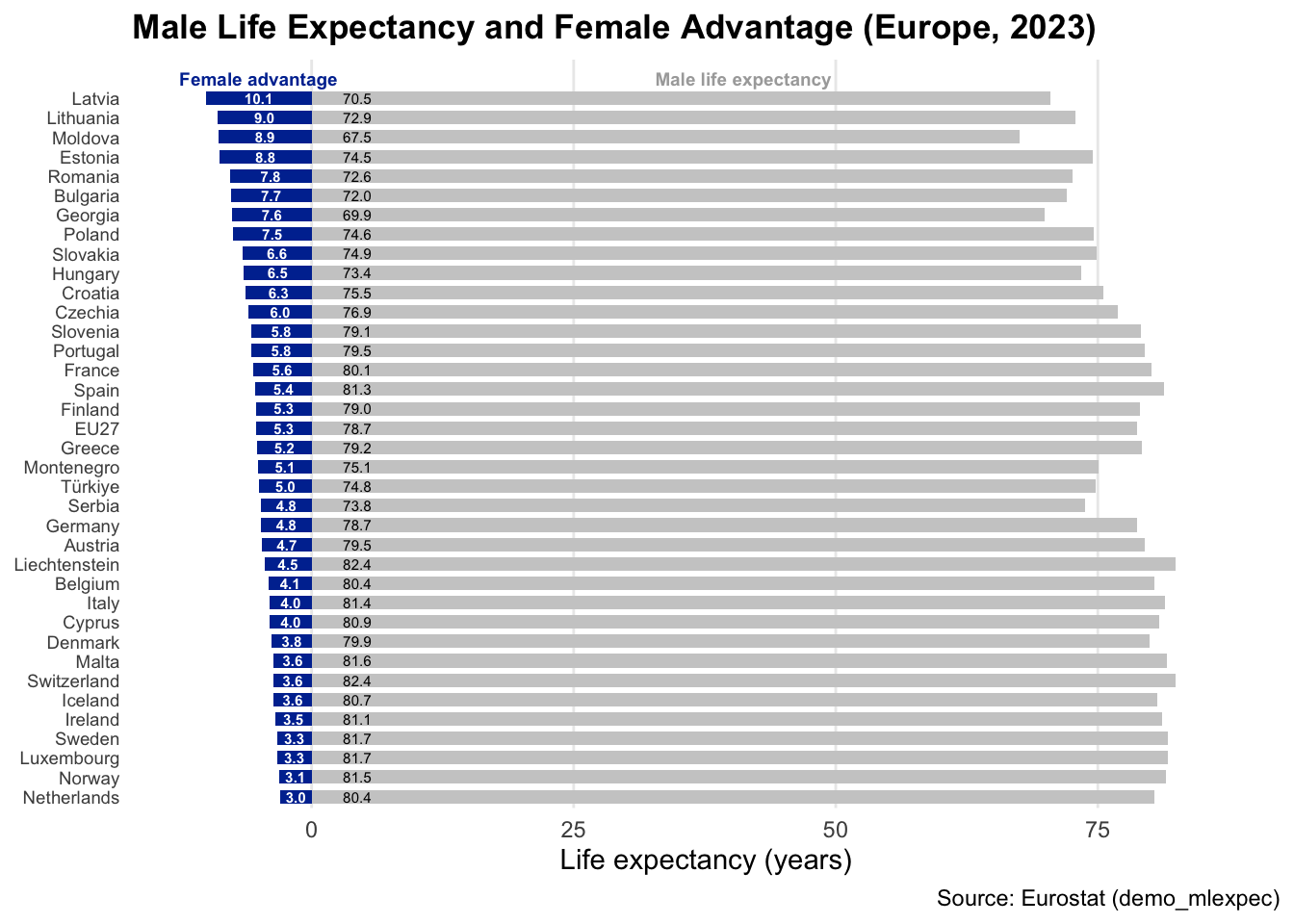
While life expectancy in Europe has increased steadily over the past decades, women continue to live longer than men in every European country. This post uses Eurostat’s dataset demo_mlexpec to visualize this gap 2023, recreating the chart from this tweet by The Polish Association for Boys and Men).
We’ll use the R packages eurostat, dplyr, tidyr, and ggplot2 packages to:
-
Retrieve official Eurostat data
-
Filter for life expectancy at birth (age < 1 year)
-
Compute the female–male gap
-
Create a clear, reproducible visualization
First, we download the data from Eurostat:
Click to show the code
library(eurostat)
library(dplyr)
library(tidyr)
library(ggplot2)

life_df <- get_eurostat(id = "demo_mlexpec", time_format = "num")
life_df <- label_eurostat(life_df)
We then filter for 2023, include only male and female life expectancy at birth, compute the female advantage (the gap in years), sort the countries by this gap, and remove aggregated regions (keeping EU-27 as a reference).
Click to show the code
df_gap <- life_df %>%
  filter(TIME_PERIOD == 2023,
         age == "Less than 1 year",
         sex %in% c("Males", "Females")
         ) %>%
  select(geo, sex, values) %>%
  pivot_wider(names_from = sex, values_from = values) %>%
  mutate(
    gap = Females - Males) %>%
  arrange(desc(gap))
# Long names are aggregates. We are eliminate all aggregates, leaving only EU27
df_gap$geo[df_gap$geo == "European Union - 27 countries (from 2020)"] <- "EU27"
df_gap <- df_gap[nchar(df_gap$geo) < 14,]
The following plot shows male life expectancy as grey bars and the female advantage (extra years women live) as blue bars extending to the left. The total length (grey + blue) corresponds to female life expectancy.
Click to show the code
gap_plot <- ggplot(df_gap, aes(y = reorder(geo, gap))) +
  geom_col(aes(x = Males), fill = "grey80", width = 0.7) +
  geom_col(aes(x = -gap), fill = "#0033A0", width = 0.7) +
  geom_text(
    aes(x = -gap / 2, label = sprintf("%.1f", gap)), color = "white", size = 2, fontface = "bold") +
  geom_text(aes(x = 3, label = sprintf("%.1f", Males)), hjust = 0, size = 2) +
  expand_limits(y = nrow(df_gap) + 2) +
  coord_cartesian(xlim = c(-max(df_gap$gap) - 2, max(df_gap$Males) + 5)) +
  annotate(
    "text",
    x = -max(df_gap$gap) / 2,
    y = nrow(df_gap) + 1,
    label = "Female advantage",
    fontface = "bold",
    color = "#0033A0",
    size = 2.5
  ) +
  annotate(
    "text",
    x = max(df_gap$Males) / 2,
    y = nrow(df_gap) + 1,
    label = "Male life expectancy",
    fontface = "bold",
    color = "darkgrey",
    size = 2.5
  ) +
  labs(
    title = "Male Life Expectancy and Female Advantage (Europe, 2023)",
    x = "Life expectancy (years)",
    y = NULL,
    caption = "Source: Eurostat (demo_mlexpec)"
  ) +
  scale_x_continuous(labels = function(x) abs(x)) +
  theme_minimal() +
  theme(
    plot.title = element_text(face = "bold"),
    panel.grid.major.y = element_blank(),
    panel.grid.minor = element_blank(),
    axis.title.y = element_blank(),
    axis.text.y = element_text(size = 7)
  )
gap_plot